
UX – Web Form Design mistakes not to make
The usability and design of web forms is not a new topic but it remains a relevant one. Why? Because there are still many sites out there that make the user experience that much more difficult for a web visitor. To strike a balance between a good and bad user experience when it comes to web forms is not that difficult.
Some web forms may be restricted because of technical limitations, for example some sites today use none customised WordPress Themes. Other developers decide to take the power into their own hands and lean toward implementing a particular design trend and customise their WordPress, Joomla or other CMS website application.
If a web form is the primary way you want your web visitors to contact you, then this is an area always worth revisiting.
Whatever the case, if the web form design creates a bad user experience, this can create several a cognitive barriers for the user. Which makes the following question – and answer very relevant: “What UX advice or suggestions would you give a designer or developer to avoid mistakes on web form design & development?”
I find that I end up gravitating to this subject a lot in UX workshops because of the questions other designers and developers ask, so in an attempt to share the wealth keep reading for some web form design mistakes not to make!
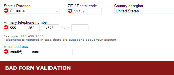
Form Validation
…Or lack thereof! Without adequate input validation, users would simply lose the will to live and exit a user journey early when receiving an error they cannot understand. There are some particularly bad examples out there. Below is one such example:
To avoid a bad User Experience in this area consider the following:
- Humanise your hints. “Invalid entry” isn’t going to help.
- Visually obvious. The colour of the text should be visually different to the copy of the form itself. However, this is only one of several ways error messages should be handled.
- Autoformat entries. Some users misuse CAPSLOCK. Reformatting an entry makes it easier for the end user and for you.
- Live feedback. It’s always better to give the user feedback for each input entry instead of waiting until the very end of the form
Misleading / Confusing tickboxes
This is has been referred to as Dark Patterns. Yes there is also a website advocating against this practice and rightly so! This a is technique where users are deceived into signing up to newsletters, unknowingly giving over their personal details, having their details sold or shared with others, buying services they do not want or need, the list goes on.
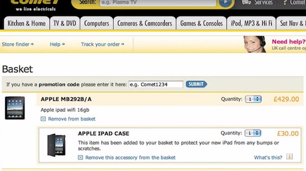
A perfect example would be Comet, who were an electrical retail chain in the UK. If a user buys a product like iPad, when the user gets to the checkout screen, an iPad case would be automatically added! The user did not deliberately shop for it. Unethical? Of course it is, but feel free to chime in with a comment below. This company was acquired a few years ago, but had loads of consumer complaints filed against them.
Below is the example in question:
To avoid a bad User Experience in this area consider the following:
- Preserving user input. Use technology to your advantage and don’t blank the form if the user makes a mistake or goes back a step to correct an earlier entry.
- Defaulting the Opt-in. This is a decision you don’t need to make for your users. If you suffer from lack of sign-ups to your newsletters or other services, perhaps a review of the content and it’s value is in order. It’s a quick way to get named and shamed on sites like Dark Patterns. Opting in should be a deliberate choice, not an automatic one.
Distinguish optional / required fields
This is another error that can cause a user to get frustrated and exit the user journey early. Clearly marking input fields that may be optional or required will make it clearer to the user which fields need attention.
To avoid a bad User Experience in this area consider the following:
- De-clutter input fields. Remove any fields that apply to a smaller subset of users.
- Form input clarity. Clearly mark “optional” and “required” fields. If you are able to limit the amount of these fields to less than 3, great.
Grouping labels / input fields
You want to ensure that a form label is close to it’s respective field. Using the principle of Gestalt’s Laws of Grouping, when objects are placed close to each other, users automatically perceive them as relating to each other. This principle has to do with how humans perceive patterns in objects and proximity falls within that principle.
An example of grouping in a typical form can be found below:
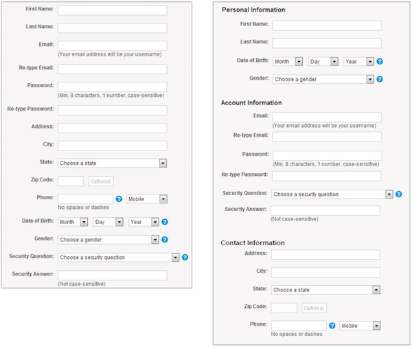
The form on the right looks easier to complete because of the way it is grouped. The fields are exactly the same though.
To avoid a bad User Experience in this area consider the following:
- Long forms. Group fields into more digestible chunks of information. Users will find it easier to process.
- Subject separation. This relates once again to the image example above. If your web form covers different subjects use grouping to create form clarity.
- Label alignment. Ensure that the field label is aligned and is in closer proximity to its respective field and any other field in the form.
Conclusion
It’s easy to talk UX theory and provide bad examples, but this is by no means an exhaustive list. These are issues I regularly encounter when working with clients of all organisational sizes. On the other hand, there are a lot of good examples out there as well. If you are new to web design or development, use this as a starting point for your checklist.
The one takeaway I hope you dear readers get from this article is that users in general do not give over their information easily if they can help it when it comes to web forms. However, the more useable and friendly you create your web forms, the more successful submissions you are going to receive.
Further reading:
- NNg Website Forms Usability: Top 10 Recommendations
- Smashing Magazine An Extensive Guide to Web Form Usability
- GoodUI User testing on fewer forms ROI results
What are the most common mistakes you have come across? It would be great to hear your feedback.

